
Rockets, Bikinis, and Lost Originals: Michele Loffredo on Italian Science Fiction Covers
Michele Loffredo is a prominent Italian art historian and critic who has bridged the gap between institutional “high art” and the vibrant world of popular illustration. With a background in contemporary art from Naples and Siena, he has served as the Director of the National Museum of Medieval and Modern Art in Arezzo and the Museum of Casa Vasari. While his professional career is rooted in the preservation of Tuscan heritage, Loffredo has spent years applying a rigorous critical lens to a field often dismissed as “minor”: science fiction illustration.
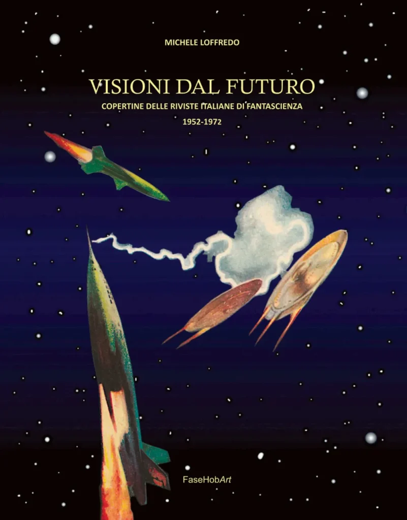
He is the author of the monumental four-volume series Le meraviglie del futuro (The Wonders of the Future), a definitive history of Italian sci-fi imagery ranging from 18th-century engravings to modern AI-generated art. His latest research, detailed in the book Visioni dal futuro (Visions of the Future), focuses on the “pioneering” era of 1952–1972. Much of this extensive research is also shared through unambiguautopia.it, a digital archive and project dedicated to the systematic cataloging and critical study of Italian science fiction’s visual heritage.
In this interview, Loffredo discusses the evolution of the genre—from the “bikini-clad astronauts” used as commercial bait to the surrealist mastery of Karel Thole—and explains why restoring these fragile, “disposable” magazine covers is essential to understanding Italy’s collective imagination during the economic boom.
What led you to isolate precisely the twenty-year period 1952–1972 as the “golden age” of Italian science fiction graphics?
The twenty-year period under examination appears homogeneous, both in its figurative models — which draw on a shared imaginative repertoire — and in the substantial presence of newsstand magazines, a presence that would not persist in the same form in the future. This balance begins to shift from the early 1970s onward.
Strictly speaking, one cannot really call those years a true “golden age,” as tends to happen when thinking about the early phases of a phenomenon. It is rather a fascinating pioneering season, marked by enthusiasm, experimentation, and a frenetic multiplication of initiatives.
The true golden age can instead be identified in the following twenty-year period: alongside the previous generation of illustrators — already possessed of a rich and articulated repertoire of science fiction imagery — younger new authors begin to emerge, while publications reach a higher level of professionalism.
It is clear that chronological boundaries are never rigid: they serve to delimit a field of inquiry, while remaining partly conventional. Nevertheless, certain historical and cultural factors help to define them with sufficient clarity.
In my previous publication, Le meraviglie del futuro, dedicated to the history of Italian science fiction illustration — from eighteenth-century engravings to images created with artificial intelligence — I divided the evolution of the field into four main phases. The third volume, in particular, is devoted to the period spanning from the 1970s to the first half of the 1990s, which may be considered the true golden age.
Returning to the question, the starting date can only be 1952, the year in which the first Italian magazines entirely dedicated to science fiction appeared: Scienza fantastica in April — exactly twenty-six years after Amazing Stories, considered the official birth act of science fiction and of the term itself, a fundamental element in the recognition of the genre.
Naturally, science fiction existed before that point as well: it appeared in various magazines and in several series, but it was still in a phase of definition and did not yet possess an autonomous and fully recognised identity. The period preceding its “official birth” is today referred to as proto-science fiction: a by now established term, but one that risks diminishing the importance of earlier production, when one considers authors such as Jules Verne, H. G. Wells, or Edgar Rice Burroughs.
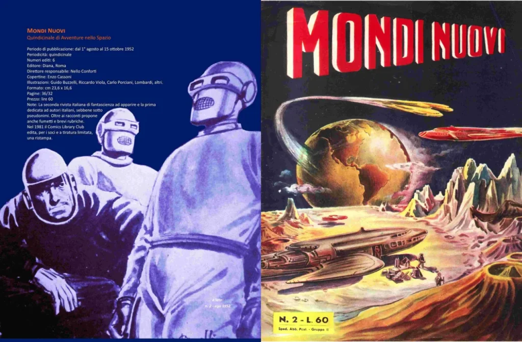
Scienza fantastica was followed, in August of the same year, by Mondi Nuovi, and finally, in October 1952, by I Romanzi di Urania, which to this day remains the principal newsstand series dedicated to the genre.
The closing date, 1972, is instead symbolically tied to the last publication of that year to reproduce models that had by then become outdated. Furthermore, I also wished to reference a catalogue reviewing the titles of that first twenty-year period, significantly entitled Vent’anni di fantascienza in Italia 1952–1972.
“The true golden age can instead be identified in the following twenty-year period”
What was the greatest challenge in sourcing and digitally restoring magazine covers that were often regarded as disposable material and poorly preserved?
Working on covers that have never been subjected to historical-critical analysis — precisely because they were considered “minor” materials in relation to official art history — entails a series of methodological problems and preliminary reflections that had to be confronted.
First of all, in order to restore dignity to a product such as science fiction, long regarded with condescension, it is essential to adopt a rigorous approach, far removed from any form of approximation or dilettantism. Only an inquiry conducted with adequate critical tools can rescue these images from the marginality to which they have been confined. This does not mean that they are masterpieces — not as an aesthetic judgement — but they are certainly a testimony to an era and to the Italian visual evolution of the genre.
For this reason, it is necessary to adopt a clear theoretical perspective: the cover — like periodical print media more generally — is a product of the society of technical reproducibility and must therefore be considered differently from the unique work destined for museums and galleries. The original of a cover, though itself a unique piece, was created with printing and mass distribution in mind. The illustration is therefore an integral part of a productive and commercial circuit that reflects society as a whole.
Unlike much contemporary art, which often positions itself in an avant-garde context and employs specialised languages sometimes accessible only to insiders, the cover communicates directly with the collective imagination. Tensions, conflicts, aspirations, and fears manifest upon it; it is a space where social, economic, and — particularly in the case of science fiction — technological changes are made visible.
In this sense, science fiction — through its themes and through the new figures it has introduced into the modern imagination, progressively replacing traditional iconographies such as sacred and mythological art, or classical genres like landscape and still life — represents one of the genuine novelties of the contemporary era. Its birth and development take place within the dimension of popular narrative, which often expresses social reality in a more direct and coherent manner than certain forms of specialist art.
Precisely because of the fragile and transitory nature of magazines — and given that the originals of covers are often scattered or lost — it becomes necessary to preserve at least their memory, if not always their physical supports. This awareness led me to systematically recover all the covers from the period under examination — some already present in my own library, others sourced with the help of collectors — so that they might be passed down and made available for study.
For an inquiry to be truly serious, however, it is not enough merely to gather the materials: they must be presented in the most appropriate manner, reworked and “restored,” just as is done with works of art. The way in which an object is treated also contributes to determining its value and cultural recognition.
In the book you describe the first period as “pioneering and substantially amateurish”: when, in your view, did the true leap in quality towards professionalism occur?
The leap in quality — at the level of publishing output — is registered from the early 1970s onward, above all with the arrival of publishers such as Libra Editrice, Editrice Nord, and Fanucci Editore. With them, science fiction took a decisive step: from the newsstand it moved permanently onto bookshop shelves, taking on a more carefully crafted and prestigious form.
The new series distinguished themselves not only through a greater editorial dignity, but also through a different iconographic approach: at times they broke free from the figurative stereotypes of the genre, choosing to use works by contemporary artists — abstractionists, surrealists, spatialists — thereby broadening the visual horizon traditionally associated with science fiction.
This is not to say that significant newsstand publications had been absent beforehand: I Romanzi di Urania, first among them, had played a fundamental role, albeit with the limitation of translations that were often abridged or adapted. It was, however, with the arrival of specialist publishers supported by editors of greater competence and experience — such as Riccardo Valla, Gianfranco de Turris, Sebastiano Fusco, Vittorio Curtoni, and Gianni Montanari — that the field reached a higher and more self-aware level of professionalism, both editorially and culturally.
In what way did the climate of the postwar period and the economic boom influence the visions of the future held by Italian illustrators?
The postwar reconstruction undoubtedly gave an extraordinary impetus to Italian ingenuity and creativity across numerous fields: from fashion to design, through to the automotive industry.
Domestic technology — the television set, the washing machine, the record player — together with iconic objects such as the Vespa or the cars produced by FIAT, marked a sharp break with the past. These were not merely new consumer goods, but tangible signs of a profound transformation in ways of living.
These objects, which rapidly entered everyday life, fed the concrete perception of having arrived at a new era: the future was no longer an abstraction, but a domestic and collective experience. It was within this climate of widespread modernisation that the imaginative world also took shape which would find in science fiction one of its most coherent and significant expressions.
“The future was no longer an abstraction, but a domestic and collective experience”
Is there an illustrator who, during your research, surprised you for their modernity or technique and who today is unjustly forgotten?
Alongside the illustrators of Urania — Curt Caesar, Carlo Jacono, and Karel Thole, by now widely recognised — other significant figures also deserve to be remembered.
Among these, Luigi Garonzi, author of over two hundred covers for I Romanzi del Cosmo, was particularly skilled in the depiction of technological structures, rockets, and spaceships, elements in which he expressed a remarkable precision and imaginative force.
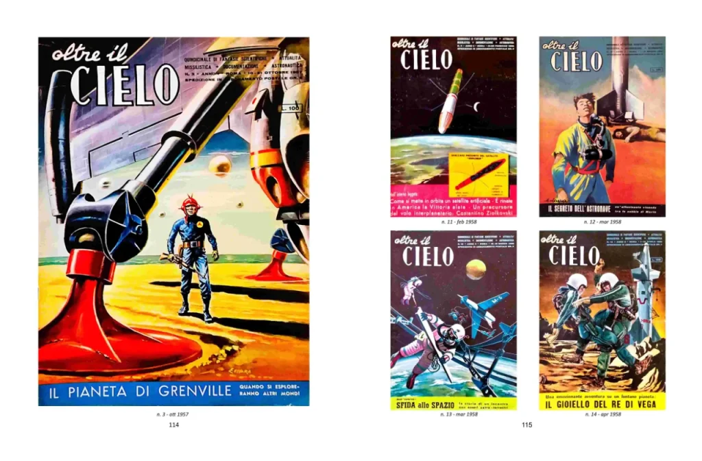
Also deserving of mention is Massimo Jacoponi, whose line was fluid and elegant, a contributor to the magazine Oltre il Cielo, a periodical dedicated to aeronautics and science fiction, to which Amedeo Gigli also contributed.
Better known to the general public are Guido Buzzelli and Gianni Renna, while forays into cover illustration were also made by Giovanni Di Stefano and Enzo Nistri — refined artists, celebrated above all in the field of film poster design — alongside other significant pittori di cinema (“cinema painters”).
The book devotes space to the cliché of the “astronaut in a bikini”: how much of those iconographic choices was naivety and how much was commercial strategy?
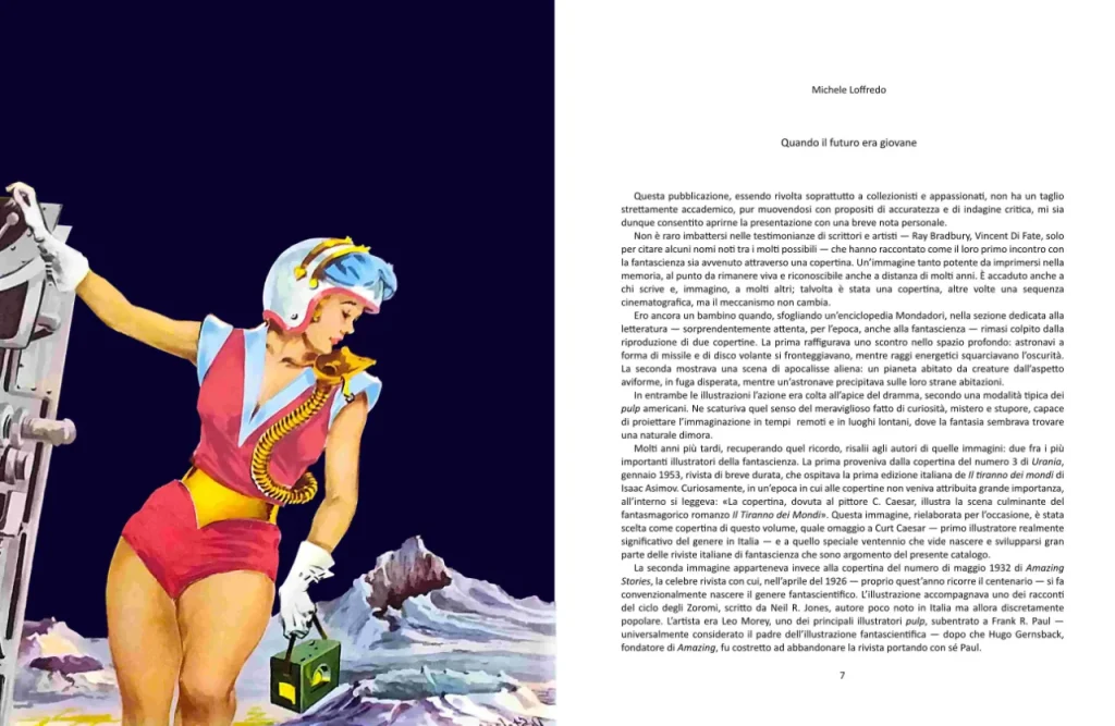
More than naivety, it was a precise commercial strategy. The cliché was adopted above all by the more modest magazines, with the aim of attracting a young audience through high-impact imagery.
In the American pulps, the iconographic model of the girl on the cover being assaulted by extraterrestrial monsters, evil aliens, or menacing robots — while the hero intervened to save her — had by then become codified: a visually immediately recognisable narrative schema, capable of conveying danger and excitement.
Over time, however, this model underwent a transformation. The female figure became more autonomous and less passive; she was no longer merely a victim, but an active presence. The clothing remained skimpy — a bikini, naturally, and a transparent helmet — though never overtly erotic, so as to avoid problems with censorship. The protagonist thus came to assume the role of a kind of testimonial figure, someone who invited the reader to enter the worlds of science fiction, embodying its allure and the promise of “adventures in space, time and dimension,” as the subtitle of one of the magazines of the era proclaimed.
“The cover communicates directly with the collective imagination. Tensions, conflicts, aspirations, and fears manifest upon it”
Why did Italian science fiction of those years feel the need to disguise itself behind Anglophone pseudonyms, and how did this influence the work of visual artists?
The choice to adopt Anglophone pseudonyms arose from a widespread xenophilia among the Italian public of the time, less evident today. A foreign name was more appealing and favoured sales, not only in publishing but in cinema as well.
In the postwar period, moreover, the Italian cultural landscape was dominated by neorealism, an orientation that left little room for the escapism and imagination typical of science fiction. Added to this were twenty years of Fascist rule, which had impoverished and isolated national culture. With the Liberation, large quantities of Hollywood cinema and science fiction narrative arrived in Italy, imposing themselves as points of reference.
Although at the beginning of the twentieth century an Italian proto-science fiction had also existed, it was progressively forgotten or considered no longer adequate to the new times. The genre thus re-entered the country as an exotic imported product.
It should also be noted that a substantial portion of intellectuals regarded popular culture with suspicion, avoiding any association with it. This attitude was partly fed by the poor quality of some magazines in the field, even though naturally not all output was of a modest level. Also contributing to reinforcing this tendency was the editorial line of the Urania editors, Carlo Fruttero and Franco Lucentini, who did not encourage the publication of Italian authors in the magazine, thereby consolidating the idea of science fiction as a predominantly foreign genre.
What role did the magazine Urania play in defining a collective visual imagination for Italians, compared to less successful publications?
Within Italian science fiction, Urania has represented — and still represents — the “flagship” of the field: one of the longest-running series in the world. Thanks to the backing of Mondadori, the most important Italian publishing house, it was able to rely consistently on professional illustrators, thus becoming a fundamental point of reference from the visual standpoint as well.
Among the first key figures was Curt Caesar, characterised by evanescent colours but a realistic, almost photographic line: to him is owed the development of the first Italian iconography of the genre. He was succeeded by Carlo Jacono, also a realist, but with bolder colours and a less visionary, more pragmatic approach. Later came Karel Thole, considered one of the great masters of science fiction illustration: with his symbolic, surrealist, and unsettling style, he was able to free science fiction from its most conventional visual clichés, offering more evocative and conceptual interpretations.
To understand the impact of science fiction on the collective imagination, however, one must look beyond the specialised readership. It was above all cinema — albeit with still rudimentary special effects — and the major illustrated weeklies that disseminated the genre at a truly popular level. Among these, La Domenica del Corriere played a decisive role: here Walter Molino produced numerous covers on the borderlands of science fiction, devoted to the space race, to the phenomenon of flying saucers, and above all to the depiction of life in the future.
It was probably these images, even more than the covers of Urania, that influenced the visual perception of science fiction among the general public.
To what extent were Italian illustrations indebted to American models (such as Galaxy or Astounding), and when did they begin to show a distinctly “European” character?
Unlike Italian writers, who struggled to find space, illustrators enjoyed greater autonomy. Italian publishers purchased the rights to novels, but not those to the original illustrations: this prevented, at least initially, a direct and sustained influence of American cover artists on the Italian market.
Only certain magazines, which reproduced American editions in their entirety, published original covers. These were, however, predominantly materials from the 1950s and 1960s — in particular linked to Galaxy Science Fiction — and therefore works already belonging to the period after the pulp era. The covers of the great pulp artists such as Frank R. Paul, Leo Morey, or Wesso did not circulate in any significant way.
I do not think one can speak of a distinctly European style; it is more a matter of individual personalities: for France, René Brantonne, closer to pulp iconography; for Germany, Johnny Bruck, who drew on classical models; while Henri Lievens for Belgium and Karel Thole for Italy moved towards surrealist atmospheres.
The Urania cover artists thus developed an artistically autonomous language. With the progressive improvement of communications, the wider circulation of colour materials, and the publication in Italy of Anglo-American illustrators — a field in which Britain too played an important role — the exchange became more direct and systematic.
From the mid-1970s onward, Italian illustrators were fully capable of equalling, and at times surpassing, their Anglophone counterparts. Artists such as Franco Storchi, Cesare Reggiani, Michelangelo Miani, and Tiziano Cremonini stand as examples of this.
Did you find a difference in visual approach between Milanese publishing houses and those from other contexts, such as publications from Udine or Rome?
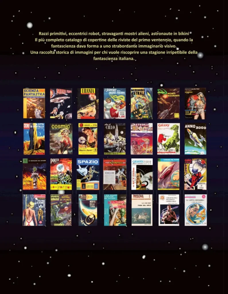
The difference concerns individual publishing ventures rather than geographical areas as such. In Milan, established publishers operated — such as Mondadori with Urania or Ponzoni with I Romanzi del Cosmo — alongside more modest publications like Super Spazio and Superfantascienza illustrata.
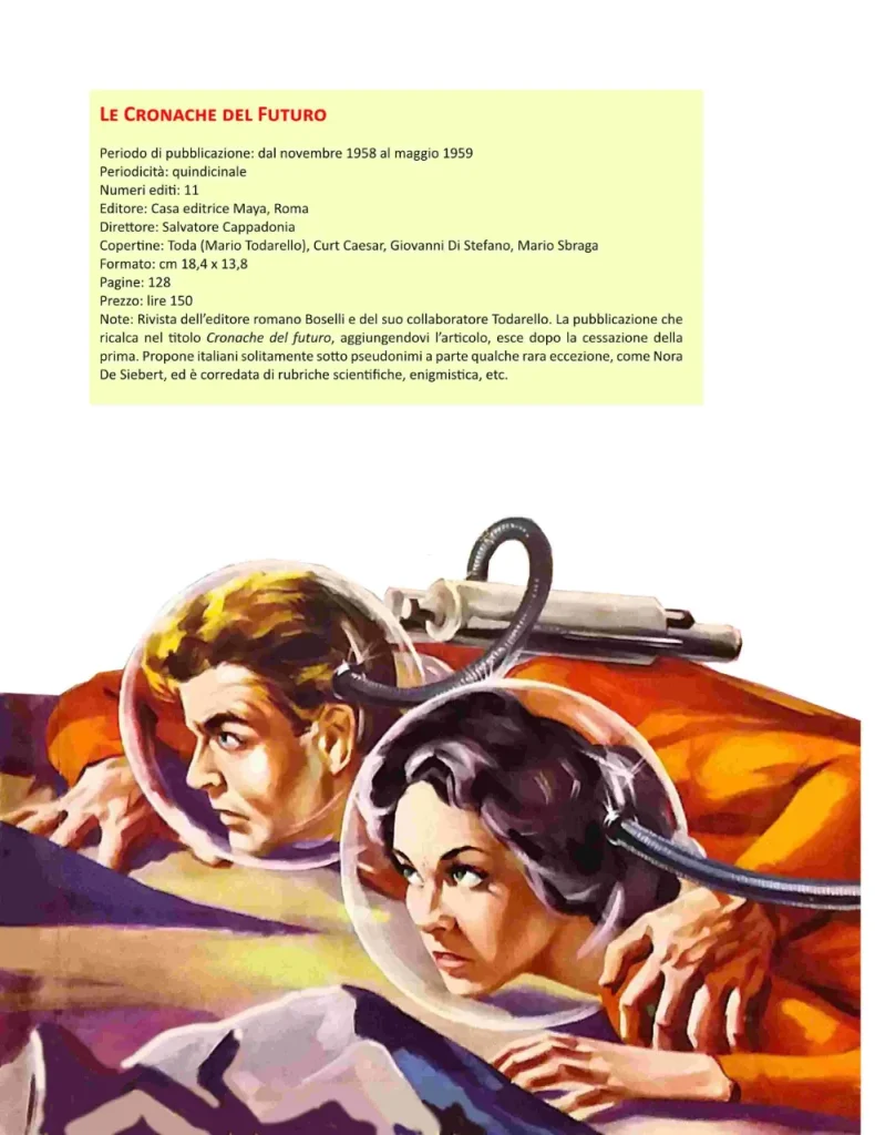
In Rome, by contrast, initiatives often appear more improvised and short-lived: magazines such as I narratori dell’Alfa Tau, Cosmic, Le Cronache del futuro, I romanzi del futuro, and Giro planetario folded after just a few issues. Of a higher standard were Cronache del futuro, which made use of covers by Curt Caesar, and Gli esploratori dello spazio. Also worth mentioning is Oltre il cielo, which reached 155 issues, though it reserved only limited space for science fiction.
Galassia, published in Udine for just five issues and illustrated by the young Gianni Renna, was instead born from an initiative by L. R. Johannis — writer, painter, and “contactee,” one of the pioneers of Italian science fiction — together with Giorgio Monicelli, who at the time was also editor of I Romanzi di Urania.
Far more significant was the activity of the publisher La Tribuna of Piacenza, which published the Italian edition of Galaxy and subsequently Galassia: with its 237 issues, the latter represented the principal qualitative alternative to Urania.
“Today original comic boards and illustrations are regularly auctioned, and no publishing house would dream of destroying originals, as happened instead to the tempera paintings by Curt Caesar made for Urania”
Many original illustrations have been lost: in the course of your research, did you come across any anecdotes about why they were not preserved by the publishing houses?
The idea that illustration was an accessory element in relation to the text — and that it belonged to a popular genre considered of little value — contributed to further devaluing it. In those years there was an absence not only of any awareness of a possible “artistic” value, but also of an economic value, which can only exist where there is a culture capable of recognising it and transforming it into a market. This awareness would take time to develop.
Today original comic boards and illustrations are regularly auctioned, and no publishing house would dream of destroying originals, as happened instead to the tempera paintings by Curt Caesar made for Urania. When the artist moved to Bolsena, he continued to send his works to Mondadori in Milan, where they were set aside because he never came to collect them. As time passed, when the volume of paper material became cumbersome for the editorial offices, it would be sent for pulping. This is what happened to Caesar’s works as well.
The keeper of the pulping facility, noticing that colour was running from a package soaked by the rain, became curious: he retrieved some boards still in good condition and took them home. Years later, an Italian illustrator, tracing the originals of Caesar, managed to purchase them. Today they form part of his private collection, but no more than five remain, out of over a hundred works produced for the magazine.
In what way did Italian industrial design of the 1960s influence the form of the spaceships and cities of the future drawn during that period?
One cannot argue that the few Italian illustrators who, in those years, were working in science fiction were particularly attentive to the design of Gio Ponti, Achille Castiglioni, Vico Magistretti, or Ettore Sottsass. Their task was above all to imagine future environments, vehicles, and accessories, but there does not appear to have been any conscious dialogue with contemporary design.
Curt Caesar frequently drew on photographs taken from periodicals; Carlo Jacono was not particularly inventive, though he was an excellent draughtsman. Massimo Jacoponi, on the other hand, showed greater inventiveness, above all in the conception of future clothing.
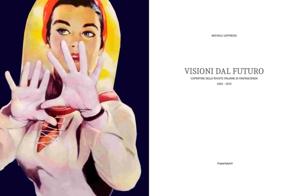
As regards spaceships, the primary points of reference were above all the space technology of the time: the rockets of Wernher von Braun constituted the dominant visual archetype, while flying saucers derived from alleged UFO sightings. On the cover of Visioni dal futuro I chose to include a reworking of an illustration by Caesar that appeared in Urania, precisely to exemplify these two fundamental models.
Only later would the Discovery spacecraft from 2001: A Space Odyssey liberate the imagination towards different forms. In early science fiction — above all in the American pulps — spaceships were for the most part cigar- or rocket-shaped; vehicles with curved fins, in an art deco taste, appear instead in the comic strips of Flash Gordon and Buck Rogers.
How did the illustrators of the period react to the actual conquest of space (the Moon landing in ’69)? Did you notice a change of style in the drawings after that event?
One cannot speak of a generalised style: each illustrator develops a personal language, while external events have only a partial influence. After the Moon landing, interest in science fiction tends to wane, above all on the part of the major national periodicals.
In Urania, Karel Thole had already taken over from July 1960, for whom the science fiction “arsenal” constituted above all a backdrop. He had no interest in a descriptive representation of spaceships, satellites, or cities of the future: these elements instead become figurative topoi, employed as instruments of displacement according to the rules of surrealism and metaphysical art. Movements that Thole introduces into illustration in order to create unsettling and alienating atmospheres, more psychological than technological.
The following generation, active from the 1970s onward, benefited instead from the greater cultural freedom that followed 1968 and expressed itself in a different manner. It was also significantly influenced by the vast repertoire of American illustration, which became a more direct and systematic point of reference.
What kind of dialogue existed between the writer and the illustrator? Did artists often read the stories, or did they work solely on suggestions from the editorial director?
It is well known that Jules Verne, through his publisher Pierre-Jules Hetzel, maintained a direct relationship with the engravers of his novels; to this day those works are frequently republished with their original illustrations.
As a general rule, however, illustrators do not read the novels they are to depict in their entirety. Sometimes this is due to limited interest in the genre — as in the case of Karel Thole — but more often it is a matter of time: the tight working schedules would not allow for a complete reading.
Usually the series editor provides a brief summary of the novel’s content and suggests a possible visual idea. The illustrator then works from a few indications, prepares one or two sketches, and the art director selects the one to be developed into the final version.
This does not rule out the possibility that, as occasionally happens with translators, there may be some exchange with the author or their heirs; these, however, are fairly rare occurrences.
Photos courtesy of Michele Loffredo

Matteo Damiani is an Italian sinologist, photographer, author and motion designer. Matteo lived and worked for ten years in China. Founder of CinaOggi.it, China-underground.com, Weirditaly.com and RetroFuturista.com.